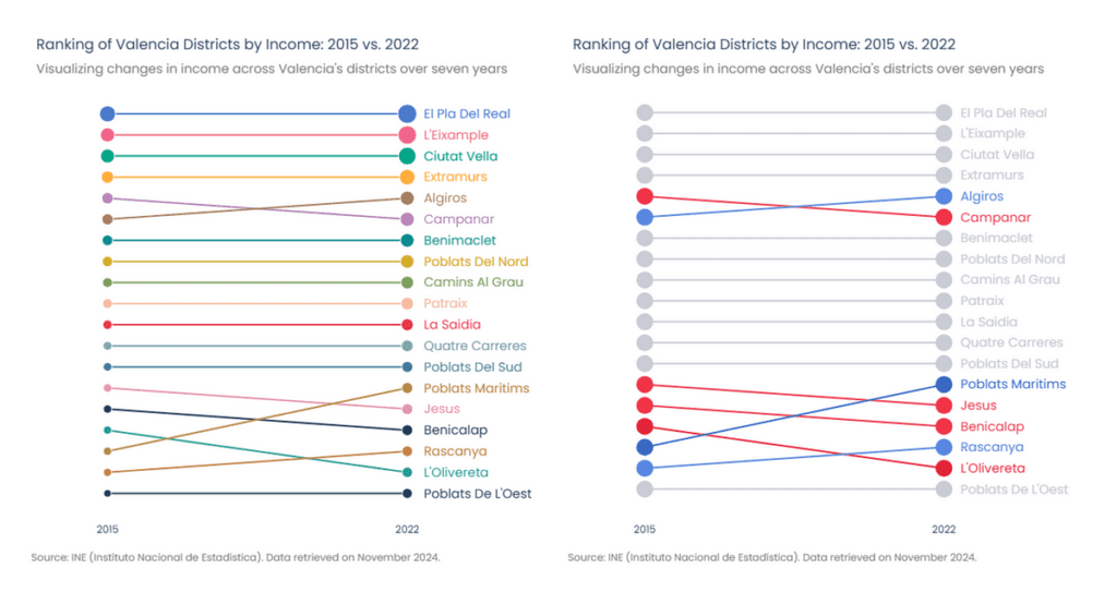
Unleashing the Power of Bump Charts in Python with Plotly
Are you intrigued by the world of data visualization but unsure where to start? Well, you’re in for a treat! Today, we’ll dive into the fascinating realm of bump charts, a powerful yet often overlooked visualization tool. With the help of Plotly, one of the most versatile libraries in Python, you can create stunning bump charts that bring your data to life.
What are Bump Charts?
Bump charts, often referred to as ranking charts, are ideal for visualizing changes in rankings over time. They allow you to see how different entities compete against each other, revealing trends and shifts that might not be clear from traditional charts. For example, imagine tracking the popularity of music records, sports teams, or even local restaurants over several months. Bump charts make these comparisons visually appealing and easy to understand.
Why Choose Plotly?
Plotly stands out as an excellent choice for creating eye-catching visualizations. With a rich set of features already at your disposal, including everything from basic bar charts to intricate statistical visuals, you can use Plotly to bring your creative ideas to life. However, as you might find, some visualizations—like bump charts—aren’t provided straight out of the box. But fear not! With some ingenuity and customization, we can make them happen.
Step-By-Step Guide to Creating Bump Charts
Ready to get started? Let’s explore how you can create bump charts using Plotly in Python.
Getting Started
First, ensure you have the necessary libraries installed. You’ll need Plotly, along with Pandas for data manipulation:
pip install plotly pandasPreparing Your Data
Before jumping into the code, gather your data. Here’s a simple example dataset you might use, tracking the rank of several items over a few months:
import pandas as pd

data = {
    'Month': ['January', 'February', 'March', 'April'],
    'Item A': [1, 2, 3, 1],
    'Item B': [3, 1, 2, 2],
    'Item C': [2, 3, 1, 3],
}

df = pd.DataFrame(data)
Plotting the Bump Chart
Next, it’s time to unleash Plotly! Let’s create a scatter plot that effectively shows the rank changes over time:
import plotly.express as px

# Transform the data for Plotly
df_melted = df.melt(id_vars='Month', value_vars=['Item A', 'Item B', 'Item C'],
                    var_name='Item', value_name='Rank')

# Create the plot
fig = px.scatter(df_melted, x='Month', y='Rank', color='Item',
                title='Bump Chart Example',
                labels={'Rank': 'Ranking', 'Month': 'Month'},
                text='Item')

# Show the figure
fig.show()
Making Your Chart Stand Out
Adding some customizations can make your bump chart even more engaging. You can play around with colors, markers, and text annotations to highlight key insights.
Real-Life Example
Let’s visualize data from a local competition, such as the best coffee shops in your city over a year. By tracking the rankings month by month, you can easily see which coffee spot is climbing the charts or even plateauing. This way, local coffee enthusiasts can make choices based on the most recent trends!
Wrap-Up
Creating bump charts using Plotly is not only rewarding but also fun! With just a few lines of code and a bit of creativity, you can transform raw data into compelling visual narratives.
Explore the endless possibilities with Plotly for your data visualization needs. Whether you’re analyzing business metrics, tracking sports rankings, or even just creating visual reports for fun, bump charts are a fantastic way to communicate trends effectively.
The AI Buzz Hub team is excited to see where these breakthroughs take us. Want to stay in the loop on all things AI? Subscribe to our newsletter or share this article with your fellow enthusiasts.


