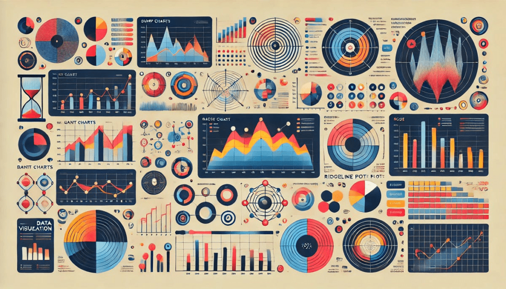
Elevate Your Data Storytelling with Unconventional Visualizations
Are you tired of the same old bar charts and line graphs? Does the thought of creating yet another basic visualization leave you yawning? You’re not alone! After creating over 350 visualizations, I’ve often found myself in the same boat. These classic charts may be simple and effective, but sometimes they just can’t capture the nuances of complex data. That’s why I’ve decided to shake things up and explore some less common visualization types that can make your data storytelling more engaging and insightful.
Why Experiment with Visualization Types?
Different types of data storytelling tools resonate differently depending on the context. Standard visualizations might not always capture the full story, especially when working with dynamic and multi-faceted datasets. By incorporating a variety of visualization styles, you can enhance clarity and engagement, making your presentations not just informative, but also visually stunning.
Seven Powerful Visualization Types
Let’s dive into seven innovative visualization types that can elevate your presentations from mundane to magnetic.
-
Bump Charts
Bump charts are like the life of the party for data visualizations! They show how the ranking of categories changes over time, enabling the viewer to grasp competitive dynamics intuitively. For instance, think of sports rankings or market share over the years. You’ve got more than just numbers; you can see who’s gaining ground and who’s falling behind in a visually engaging way. -
Sankey Diagrams
These flow diagrams are perfect for visualizing energy or material transfers between stages in a process. Ever wondered how energy flows through your home or how traffic moves through a busy intersection? A Sankey diagram can bring that data to life with vibrant flows that communicate volumes. -
Heat Maps
Heat maps are fantastic for presenting data trends over space, such as crime rates across a city or sales figures within various geographical regions. The color gradients instantly draw the eye to areas of interest, making it easy for the viewer to interpret data at a glance. -
Treemaps
If you have hierarchical data, treemaps can be a game-changer. They use nested rectangles to show proportions and relationships, allowing viewers to understand part-to-whole relationships in a visually engaging manner. Think of visualizing a company’s revenue across its various divisions; treemaps make this easily digestible. -
Network Graphs
Want to show relationships among items? Network graphs can visualize how various entities are interconnected, whether it’s social media connections, co-authorship in research, or web link structures. They help paint a bigger picture of interactions in a clear, visually appealing way. -
Bullet Graphs
Instead of regular bar charts, consider bullet graphs to present performance against targets more effectively. They condense a wealth of information into a single, compact visual that’s perfect for dashboards and executive reports. - Spider Charts
Also known as radar charts, spider charts are ideal for comparing multiple variables. This is useful in showcasing individual performance metrics or competitive analysis—imagine comparing the strengths of different products across several attributes.
Bringing Your Visuals to Life
Once you decide which visualization type is best for your data, the next step is creation. Tools like Tableau make it relatively easy to design these various charts. You can find tutorials online that guide you through the process of making bump charts, Sankey diagrams, and more.
Conclusion
Exploring different visualization techniques can dramatically enhance your data storytelling game. By incorporating these unique visualization types, you’ll find that data becomes not only more engaging but also more accessible to your audience.
The AI Buzz Hub team is excited to see where these breakthroughs take us. Want to stay in the loop on all things AI? Subscribe to our newsletter or share this article with your fellow enthusiasts.


